Pokémon cards that feel like paintings.
When the card forgets it is a card.
Some Pokémon cards do not behave like product. They behave like paintings — composition before chrome, light before logo, painter before frame.
This guide collects cards where the medium has shifted away from product illustration toward something closer to painting practice. The criterion is not era, set, or illustrator — it is the way the card reads when you look at it.
Across nine selections, the same set of habits recurs: restrained palettes, single-figure compositions or true landscape framing, hand-painted brush trail visible on the surface.
Nine cards that feel painted.
Selected for compositional and material values that read as painting first.
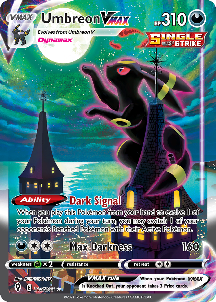
Umbreon VMAX
2021Ito’s nocturne. Moonlight on dark fur — no card chrome competing in the eye line.
View card
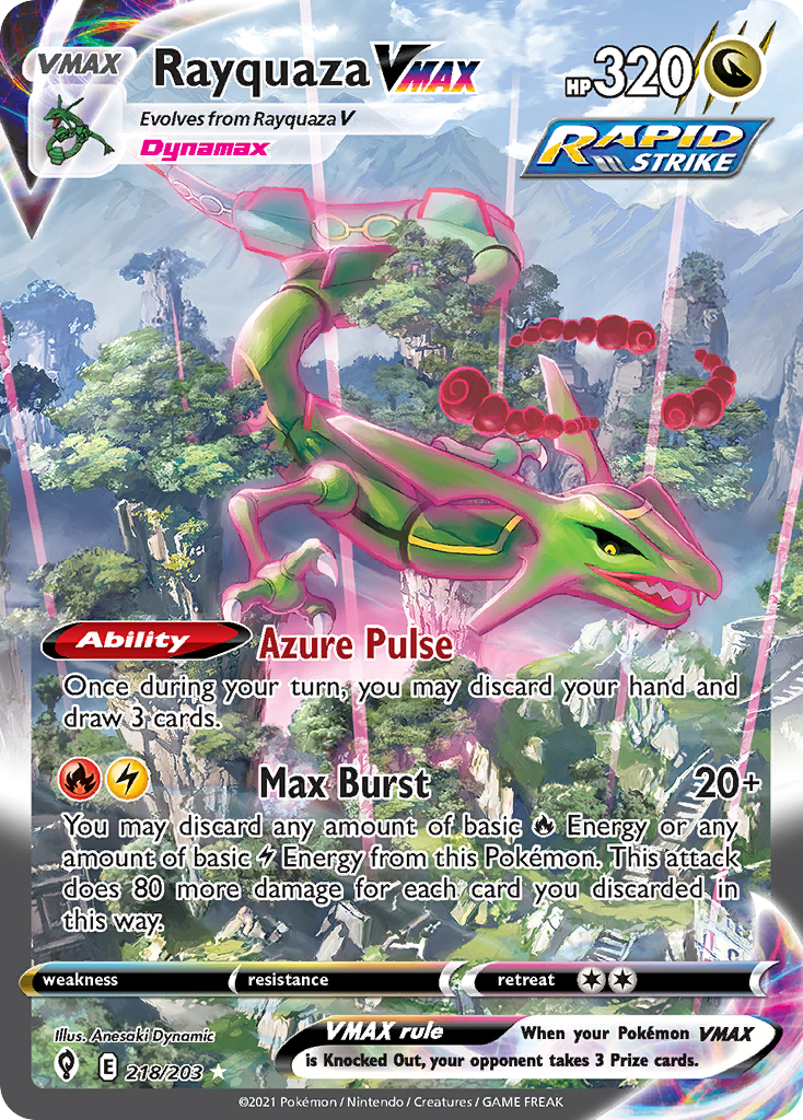
Rayquaza VMAX
2021A landscape painting at card scale. Altitude treated as discipline.
View card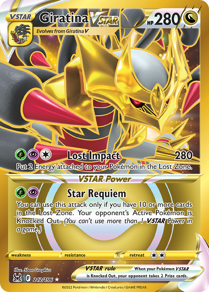
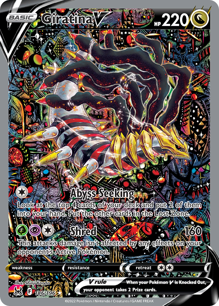
Giratina VSTAR
2022The card becomes a wound in the picture plane — Giratina entering, not posed.
View card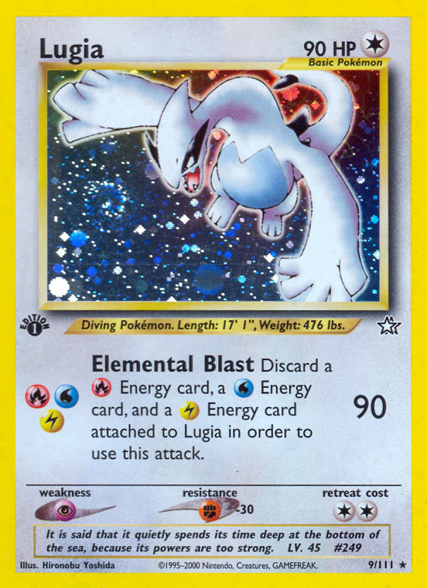
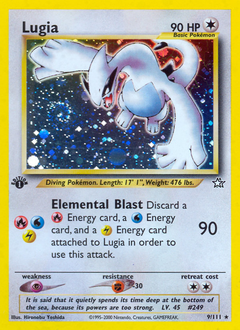
Lugia
2000A holographic card whose foundation is pale cream paper. Yoshida paints air as easily as bird.
View card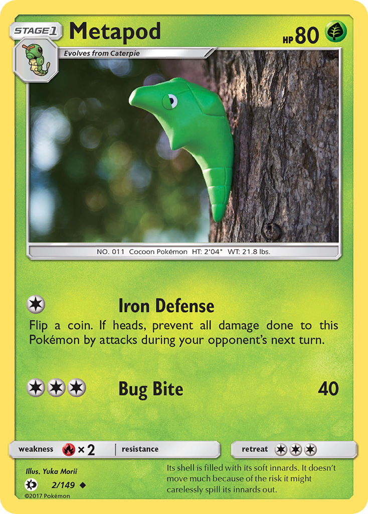
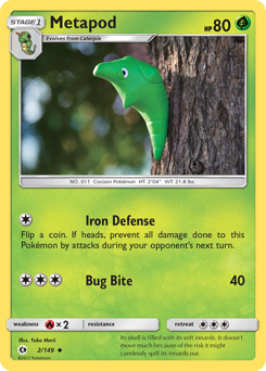
Metapod
2017Morii’s clay-modelled Metapod, photographed in real foliage. The chrysalis as still life — sculpture and painting in the same plate.
View card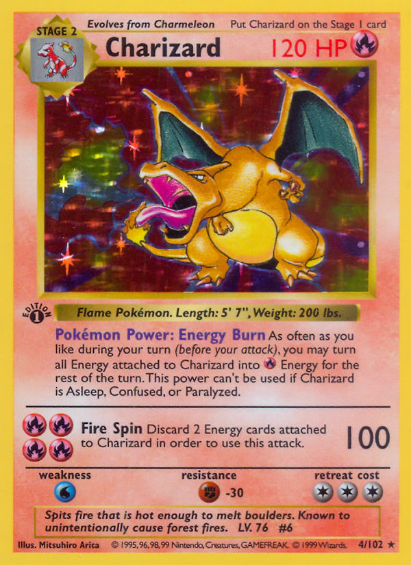
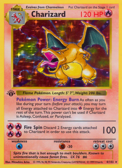
Charizard
1999The founding plate. Even at the medium’s start, the painter’s hand is the dominant signal.
View card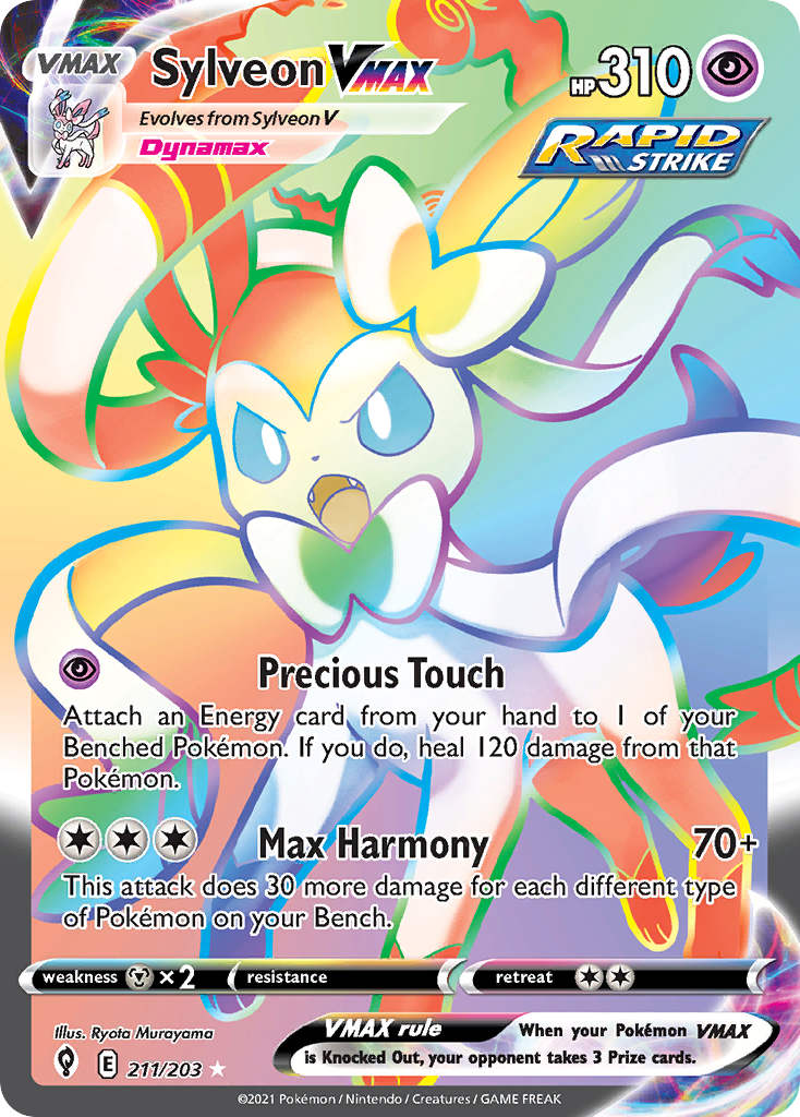
Sylveon VMAX
2021Ribbon-fairy alt-art — Murayama’s palette redrew the type with one card.
View card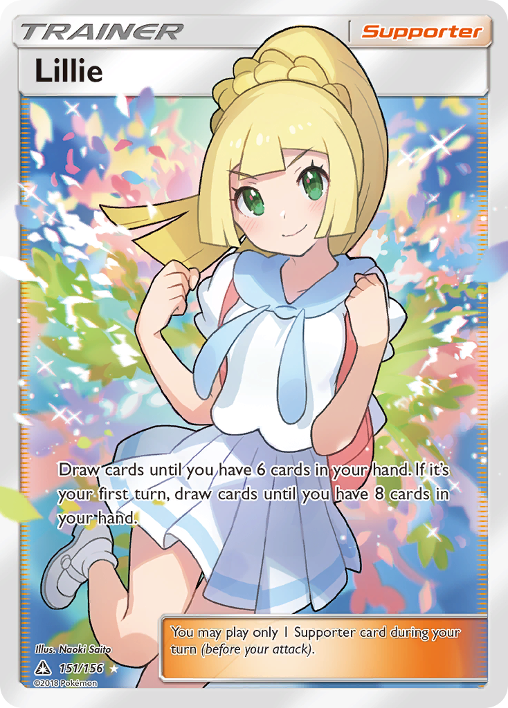
Lillie
2018A trainer plate that reads as portrait painting — soft, golden, museum-bright.
View card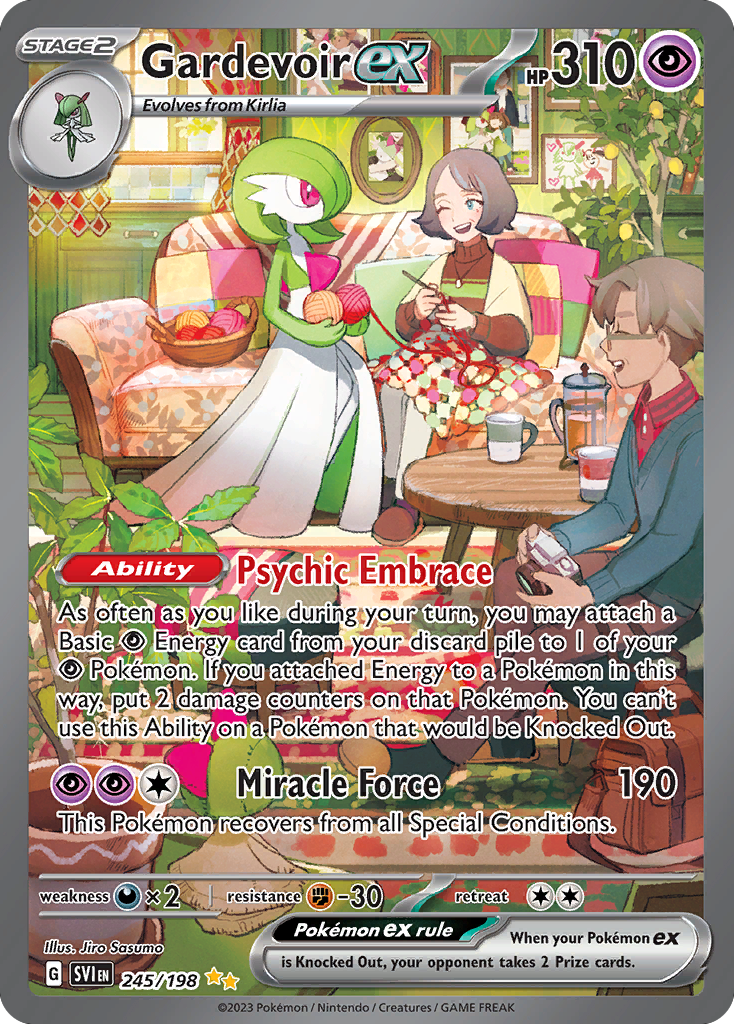
Gardevoir ex
2023Sasumo’s Gardevoir reads as ballet, not battle. Vertical composition, painterly cool palette.
View cardWhat painterly looks like, on a card.
Three threads recur — the criteria the selection was built against.
- Defining style
- Hand-painted brush trail visible on the surface; or hand-modelled volume in Morii’s case. The figure precedes the frame. Look for surface texture that resists the card’s chrome — pigment grain, brush direction, the small irregularities that printing does not smooth out.
- Common compositions
- Single-figure portrait or true landscape framing. The card does not crowd; the painting does not multitask. Negative space is treated as material — the empty quadrant is part of the composition, not waste.
- Adjacent moods
- Tender, reverent, atmospheric, nocturnal. Combative cards rarely belong here — too much of the work is doing chrome. The exception is when combat is held in painterly restraint, like a baroque battle scene reduced to two figures and a single light source.
More cards with this feeling.
Visual-theme guides are selected by Artchu editorial — weighing composition, palette, mood, and material qualities across the catalogue. The selection cuts across painter, Pokémon, set, and era; availability of high-quality imagery is a baseline criterion. Rarity, market value, and grading are not selection criteria.