Pokémon cards painted in watercolour.
When the water is still visible
Watercolour cannot hide its making. That is the point.
Most modern card art is digital and seamless — colour laid down without a trace of how. Watercolour is the opposite: it records its own making. The wash pools and dries unevenly; pigment blooms where it meets wet paper; an edge is left to bleed or held crisp on purpose; the white of the paper is saved to glow. This guide gathers cards that keep that evidence visible. Reading them is reading the medium — the way the water moved, where it was let go, and where the hand stepped back and let the paint decide.
Eleven cards where the water shows
Chosen for genuine wet-media behaviour — wash, bloom, transparency, reserved edge — not for being broadly “painterly.”
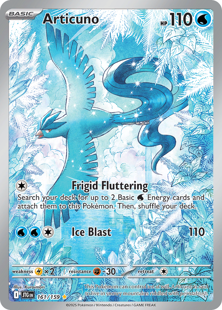
Articuno
2025Almost all water. Articuno is built from pale icy washes that bloom into the background — the bird half-dissolved into the wet blue it stands in.
View card
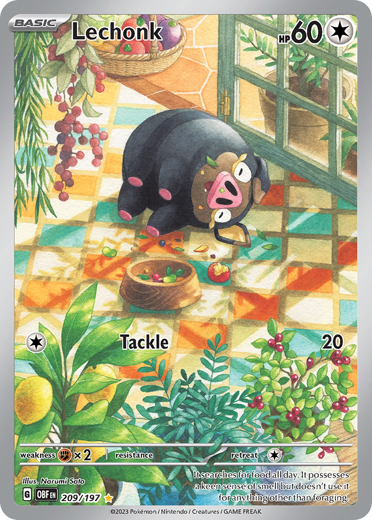
Lechonk
2023A garden left loose. Loose washes of green and warm light, edges allowed to bleed into one another — the scene held together by colour, not line.
View card
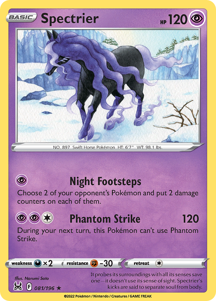
Spectrier
2022The figure giving way. Spectrier’s violet form bleeds at its edges into the wash behind it, mane and mist sharing the same wet pigment.
View card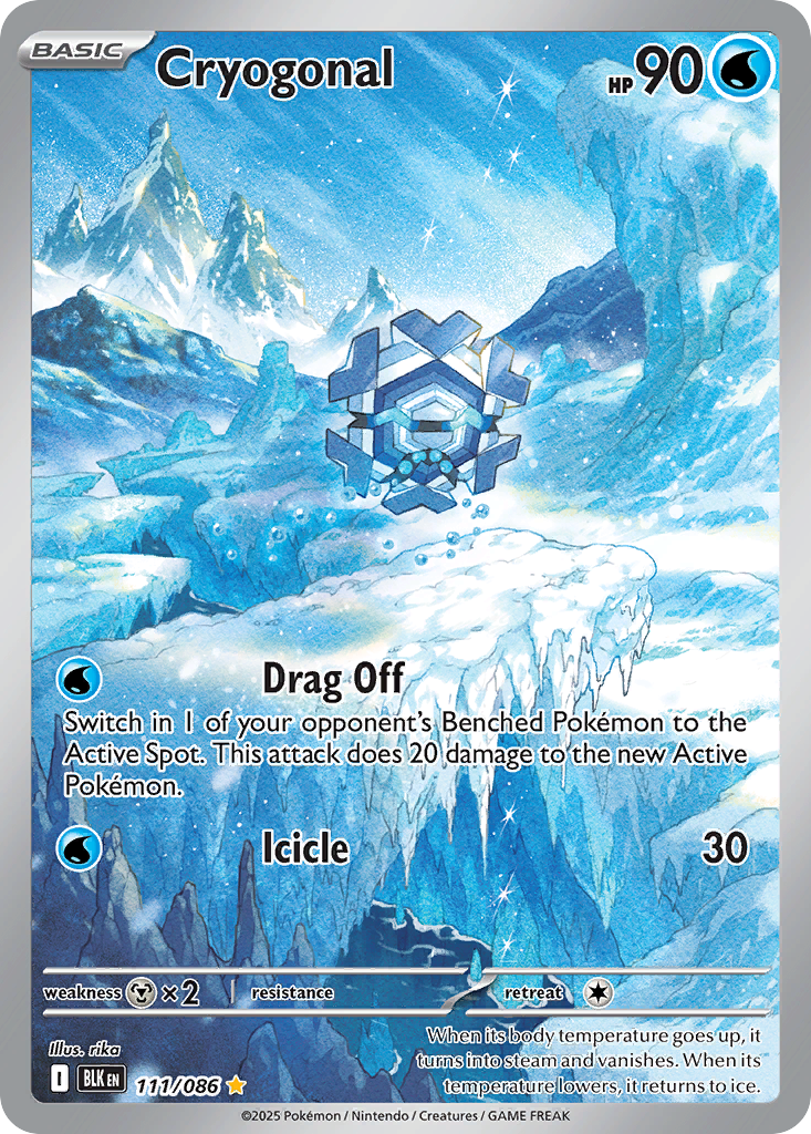
Cryogonal
2025Transparency itself. Thin blue laid so the paper glows through — the crystalline body and the air around it made of the same translucent wash.
View card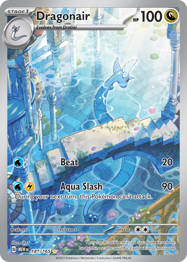
Dragonair
2023The wet line. Dragonair flows in long ribbons of blue, the brushwork still liquid, the body and water reading as one continuous stroke.
View card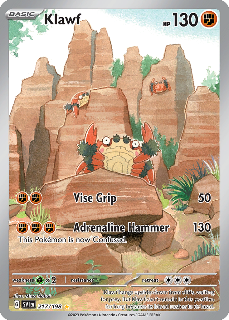
Klawf
2023Watercolour gone dry and warm. Ochre rock built from granular, broken washes — the technique used for grit and stone, not just calm.
View card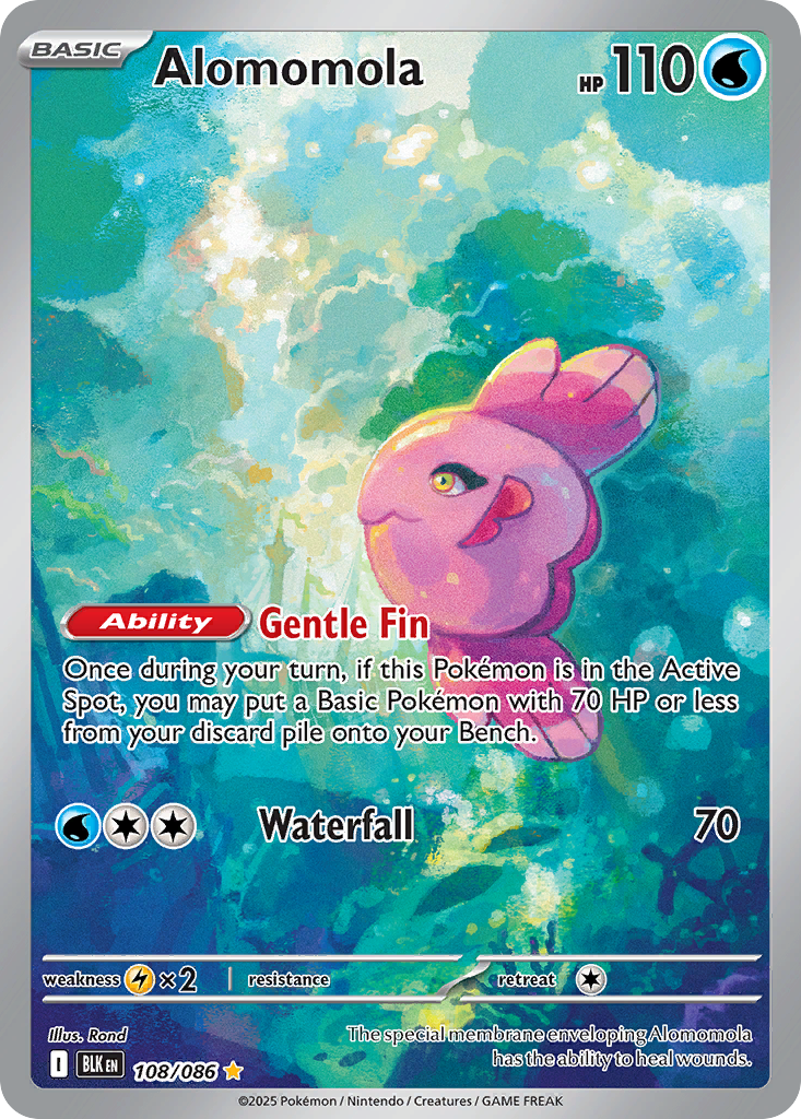
Alomomola
2025Pigment in suspension. Pink and turquoise drift through an aqueous field, the colours pooling like dye in water around a weightless body.
View card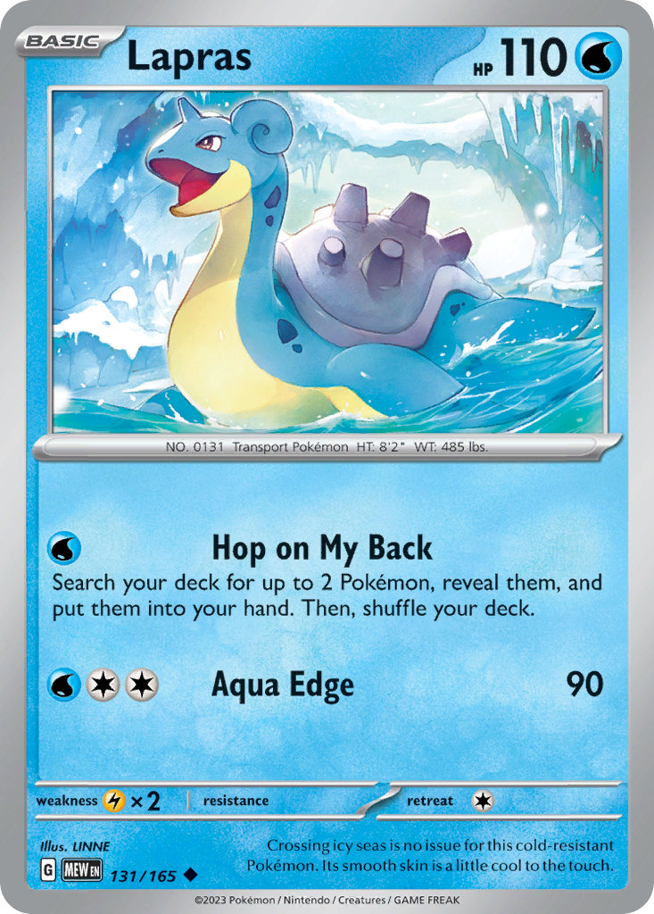
Lapras
2023A calm seascape. Quiet washes for sea and sky, the gentlest gradient allowed to do the work — restraint as the whole effect.
View card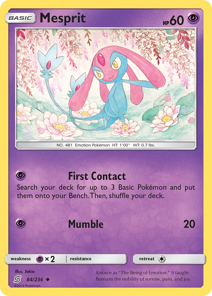
Mesprit
2019Mist and blossom. Mesprit floats among washes of pink and lavender, the background dissolved to atmosphere — the figure barely anchored.
View card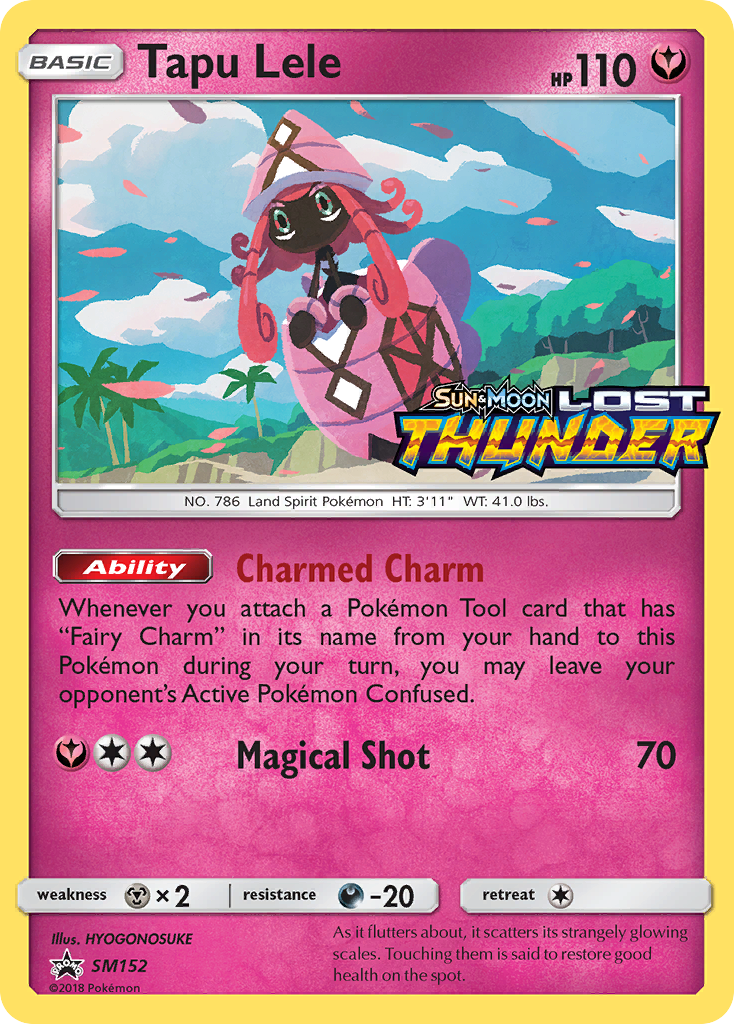
Tapu Lele
2017Paper-light. A bright, airy wash with the white of the page kept open — luminance built by leaving paint out, not piling it on.
View card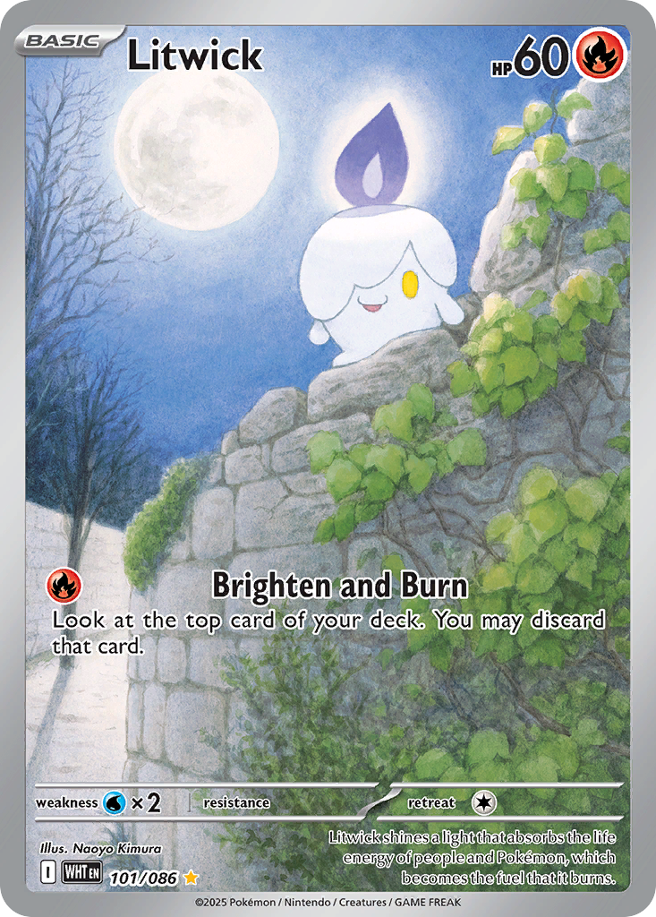
Litwick
2025Watercolour after dark. A small candle and a clouded moon in damp blues — proof the wet medium can hold night as gently as daylight. (Shared with the night-scenes guide.)
View cardHow to read the water
Three behaviours that mark genuine watercolour — and separate it from digital smoothness.
- The bloom and the bleed
- Where wet pigment meets wet paper it spreads on its own — soft-edged blooms and backruns the artist only partly controls. These uneven, organic edges are watercolour’s signature, and digital gradients cannot fake them convincingly.
- Transparency and the white of the paper
- Watercolour is see-through; light comes from the paper beneath, not from added white. The brightest parts of these cards are often where the least paint was laid — luminance by reservation, not by highlight.
- Where the hand steps back
- The medium has a will of its own. The best of these cards let the water decide some things — a pooled edge, a granular settle — so the image is a collaboration between the painter and the paint, not total control.
More to read.
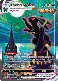
This guide gathers Pokémon cards that read as genuine watercolour — chosen for wet-media behaviour (wash, bloom, transparency, reserved edge), not for a broad “painterly” look or for rarity, market value, or grade. Selections span illustrators and eras and are refreshed periodically.